Create a super cool Navbar using React and TailwindCSS
Learn how to create a Navbar using React and TailwindCSS. It is a step-by-step guide to building something cool.

👋 Hey there! I'm Shivam, a self-taught web developer from India. My passion lies in web development, and I thrive on contributing to open-source projects and writing technical blogs. 🚀
Teamwork fuels my creativity, and I take pride in building efficient, user-friendly solutions. Let's code together! 💻🌟
Hey Developer Community, as we all know, "Learn By Doing" is one of the best ways to learn new technology or concepts. So, today we will build a project which will help us to understand some concepts of React JS, Tailwind CSS, and CSS.
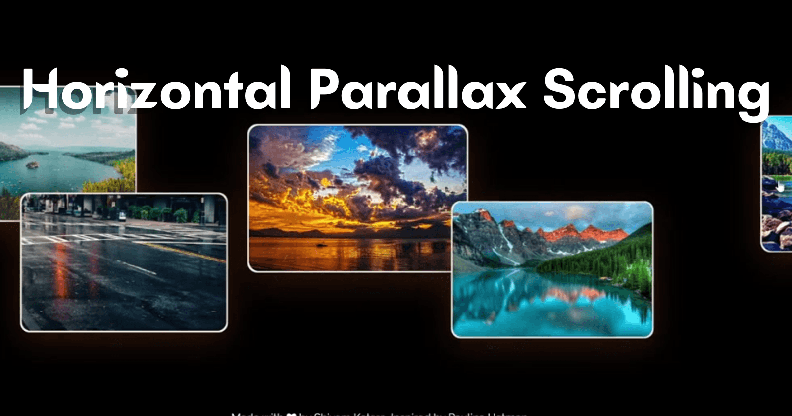
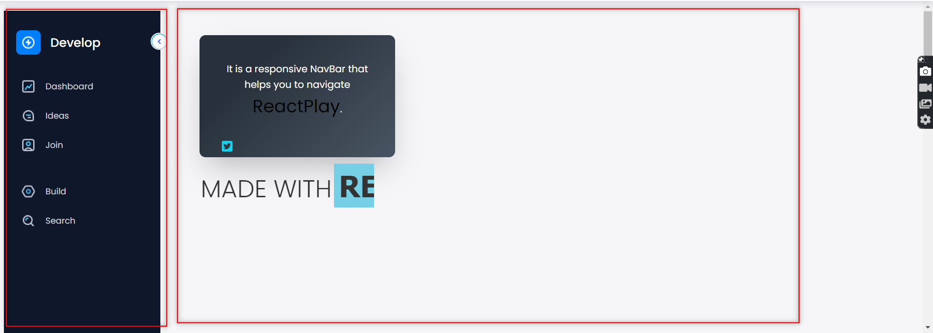
So without further delay, let's see what we're going to create and how we intend to build it
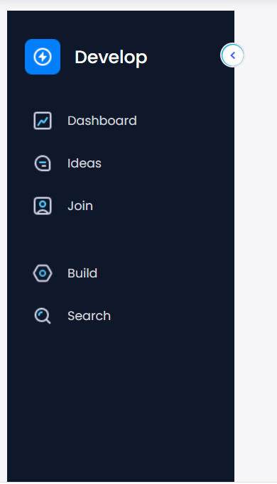
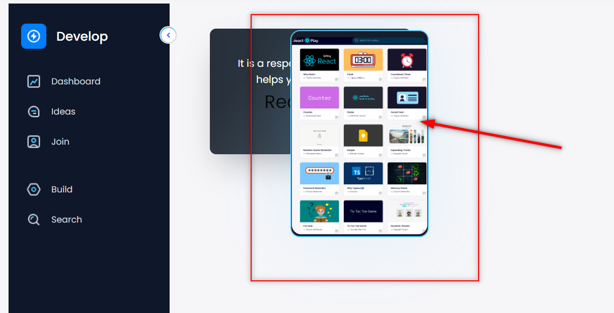
Preview 👇
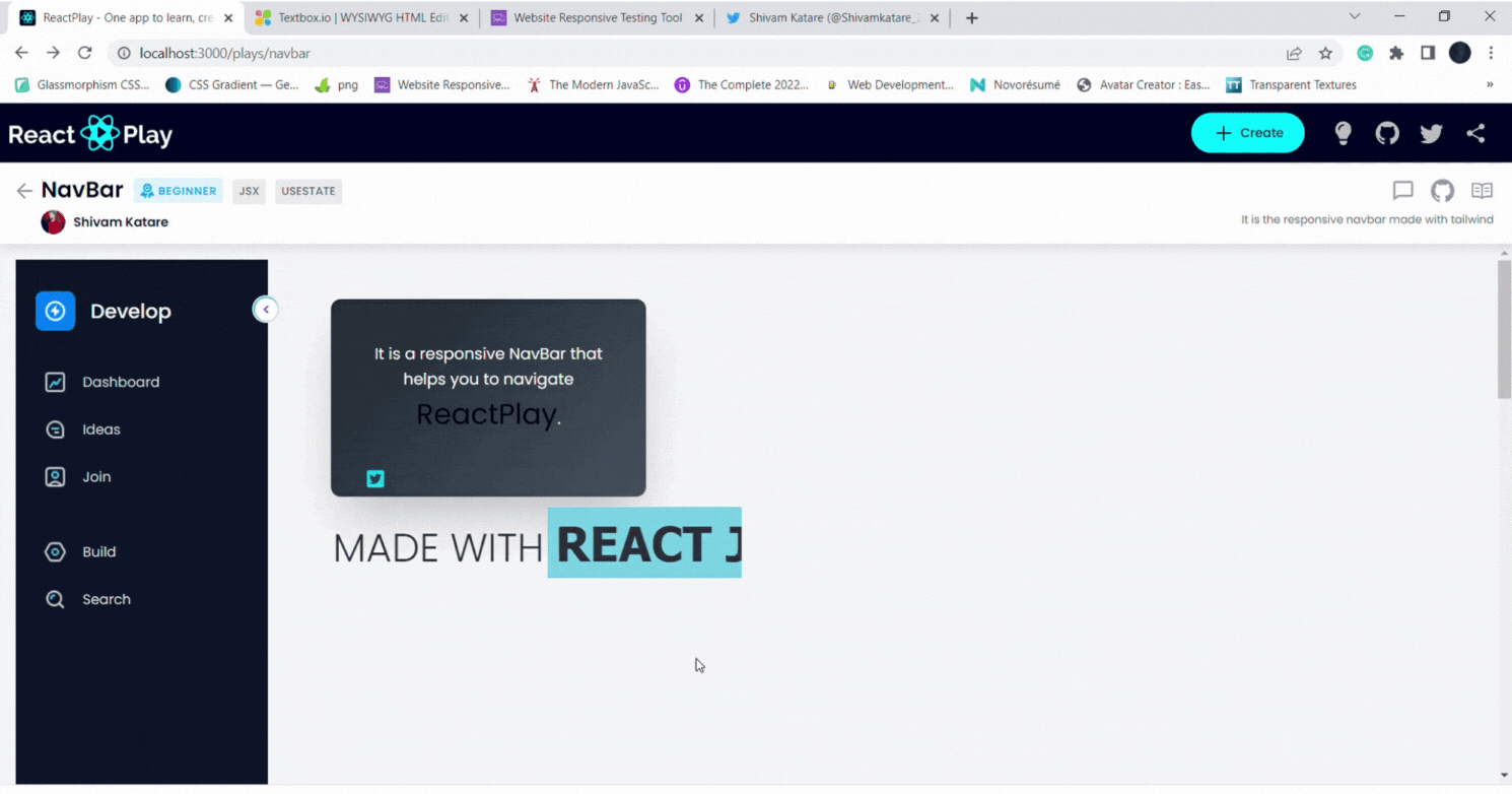
Now, if you are excited to build this 👆 then let's get started.
Prerequisties
- Basics of React JS
- Basics of Tailwind CSS
- Basics of CSS
This blog will concentrate on the logic behind this project. For the styling, please see my GitHub repo and follow along with it.
Build Side Navbar
As you can see, there is two div present here👇. The first one contains the side navbar, and the second one has our animation data.
So, firstly we will build the side navbar.
Step 1: Setup React project in the code editor. Here I am using VS code(You can choose as per your choice).
Step 2: Setup Tailwind CSS in the project.
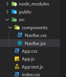
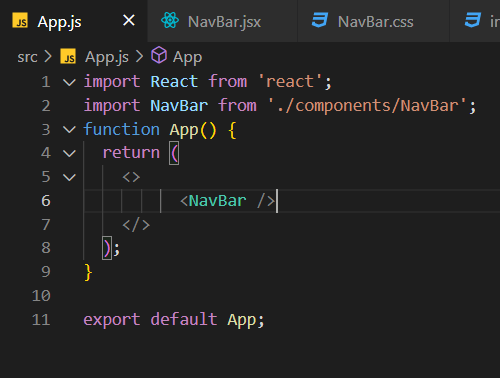
Step 3: Create a components folder inside the src folder and then, create two files in it named NavBar.jsx and NavBar.css. Like this👇
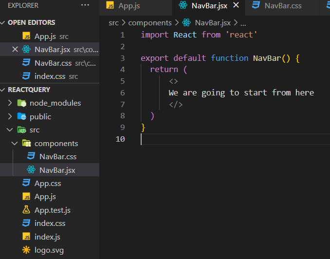
Step 4: Now, inside NavBar.jsx create a functional component. Like this👇
And import it into the App.js file. Like this👇
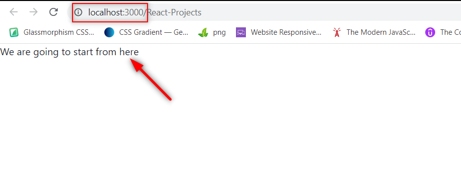
Step 5: Start your localhost server by running the npm command. Like this👇
npm start
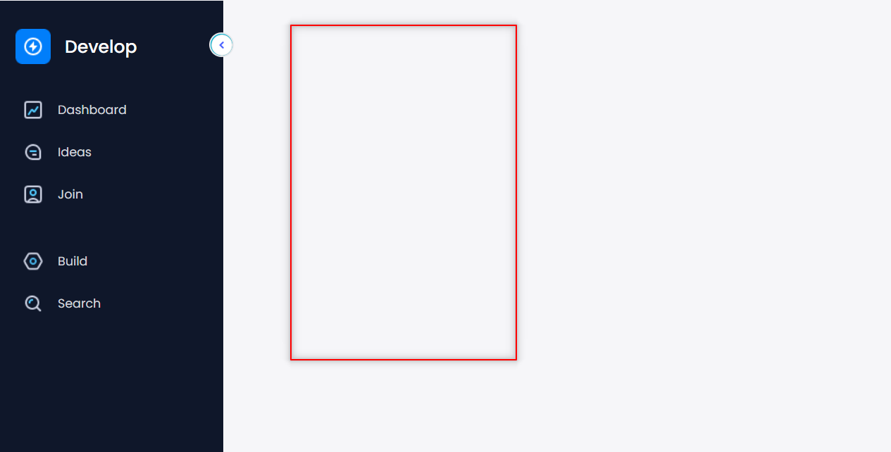
The output will look like this 👇
Now, firstly we will build this 👇 list thing.
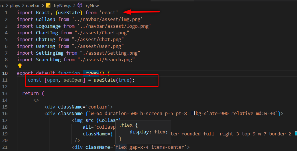
Step 6: Now, we will write code for Side Navbar and some Tailwind CSS to it.
JS

import React from 'react'
import Collasp from '../navbar/assest/img.png'  //importing image
import LogoImage from '../navbar/assest/logo.png'  //importing image

export default function NavBar() {
    return (
        <>
            <div className='navbar-play-contain'>
                <div className={`w-64 duration-500 h-screen p-5 pt-8 bg-slate-900 relative md:w-30`}>
                    <img src={Collasp}  //using imported image
                        alt='collasp'
                        className={`absolute cursor-pointer rounded-full -right-3 top-9 w-7 border-2 bg-cyan-500`}
                    />
                    <div className='flex gap-x-4 items-center'>
                        <img src={LogoImage}  //using imported image
                            alt='play-logo'
                            className={`cursor-pointer duration-500`}
                        />
                        <h1 className={`text-white origin-left font-medium text-xl duration-300`}>Develop</h1>
                    </div>
                </div>
            </div>
        </>
    )
}
The output will look like this.👇[ If you are unfamiliar with Tailwind CSS, then you can take a guide from this cheetsheet
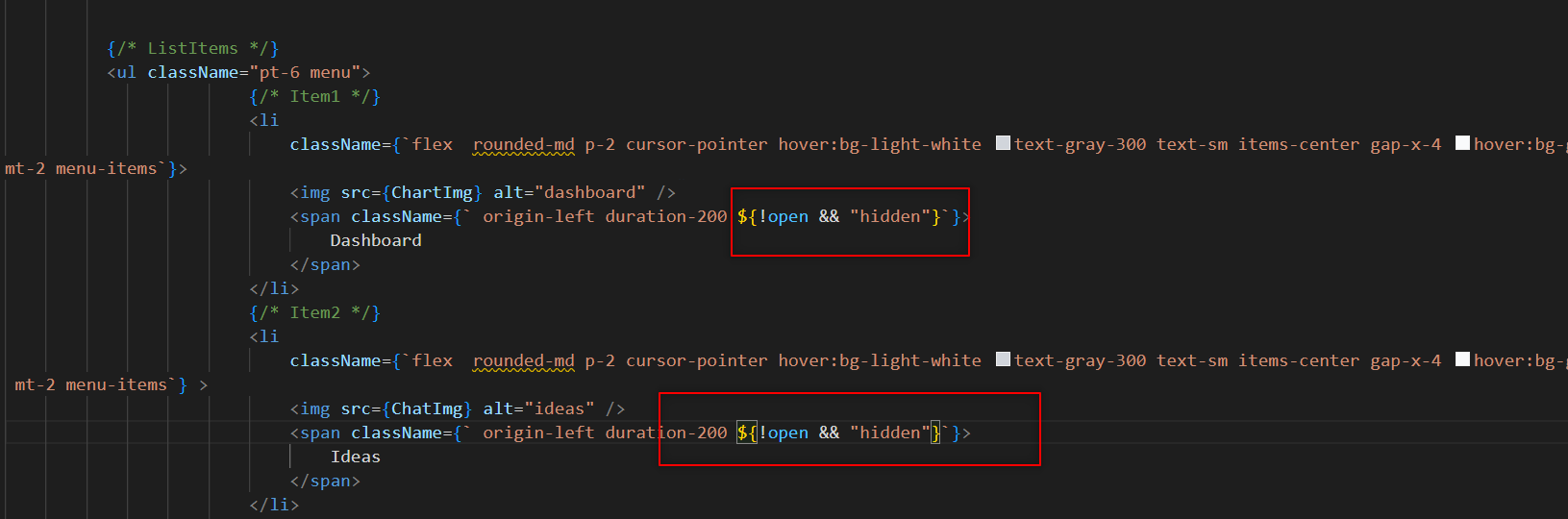
Step 7: Now, we will add the list. To add the list, we have to write this code.👇
JS

 {/* ListItems */}
<ul className="pt-6 menu">
     {/* Item1 */}
      <li
          className={`flex  rounded-md p-2 cursor-pointer hover:bg-light-white text-gray-300 text-sm items-center gap-x-4 hover:bg-gray-50 hover:text-slate-900 rounded-md
mt-2 menu-items}>
          <img src={ChartImg} alt="dashboard" />
          <span className={` origin-left duration-200`}>
              Dashboard
          </span>
      </li>
      {/* Item2 */}
      <li
          className={`flex  rounded-md p-2 cursor-pointer hover:bg-light-white text-gray-300 text-sm items-center gap-x-4 hover:bg-gray-50 hover:text-slate-900 rounded-md
 mt-2 menu-items} >
          <img src={ChatImg} alt="ideas" />
          <span className={` origin-left duration-200`}>
              Ideas
          </span>
        </li>
        {/* Item3 */}
        <li
            className={`flex  rounded-md p-2 cursor-pointer hover:bg-light-white text-gray-300 text-sm items-center gap-x-4 hover:bg-gray-50 hover:text-slate-900 rounded-md
 mt-2 menu-items `} >
            <img src={UserImg} alt="join" />
            <span className={` origin-left duration-200`}>
                Join
            </span>
        </li>
        {/* Item4 */}
        <li
            className={`flex rounded-md p-2 cursor-pointer hover:bg-light-white text-gray-300 text-sm items-center gap-x-4 hover:bg-gray-50 hover:text-slate-900 rounded-md
mt-9 menu-items `} >
            <img src={SettingImg} alt="build" />
            <span className={` origin-left duration-200`}>
                Build
            </span>
        </li>
        {/* Item5 */}
        <li
            className={`flex  rounded-md p-2 cursor-pointer hover:bg-light-white text-gray-300 text-sm items-center gap-x-4 hover:bg-gray-50 hover:text-slate-900 rounded-md
mt-2  menu-items `} >
            <img src={SearchImg} alt="search" />
            <span className={`origin-left duration-200`}>
                Search
            </span>
        </li>
   </ul>
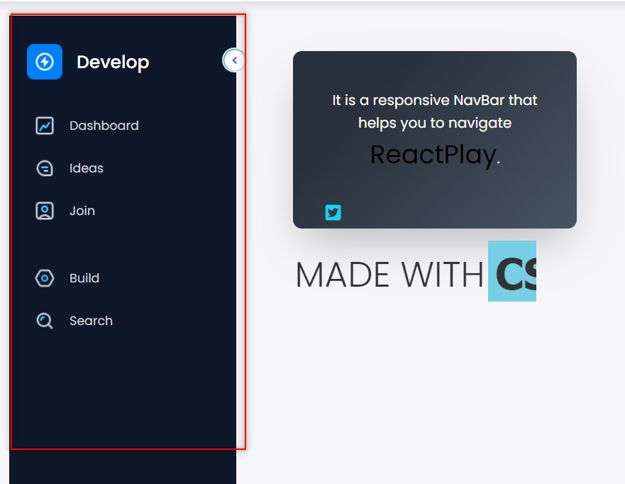
Now, the output will look like this👇
Note-I imported an image from my local computer into the image tag. You can get the same photographs from here.
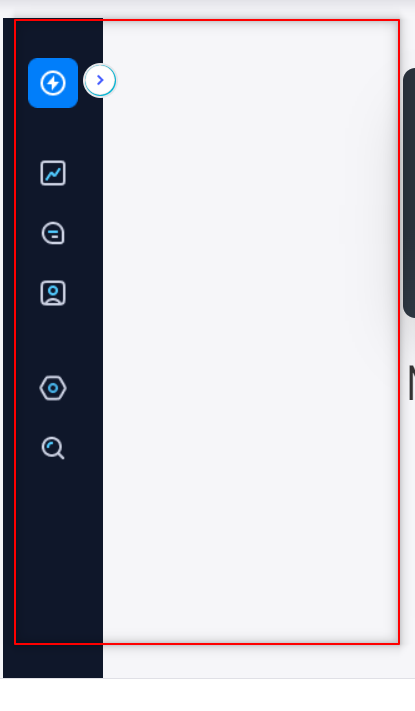
Now, we made our side navbar, but it's not working. Now, we will add our useState logic to make this navbar work.
Step 8: Import useState, and create a new state named open and setOpen.
JS

import useState from 'react'
const [open, setOpen] = useState(true);
Your code now should look like this.👇
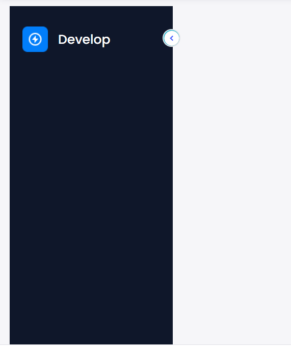
Now we will write the code to collapse the navbar whenever we click the button.
Collaspe Navbar
You may now view in our code that the width of our navbar is 64 pixels (w-64). So, we need to change the width of the navbar whenever we click on the collapse button. So, to do this, we need to use ternary operator with our useState values.
So, make a new function named handleClick. Like this 👇
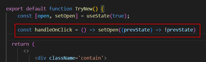
It'll handle our open state. Now, alter the width of the navbar with the ternary operator. To do so, add the onClick function to the button picture.
Like this👇
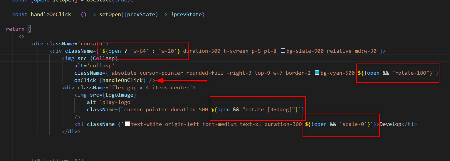
The navbar will now be closed if you click the collapse button. But the list of the navbar will not be going to collapse. To implement, add the open state to each list item.
Like this👇
Now, the whole output will look like this👇
And, the code of the above output will be👇 this.
JS

import React, { useState } from 'react'
import Collasp from '../navbar/assest/img.png'
import LogoImage from '../navbar/assest/logo.png'
import ChartImg from "./assest/Chart.png"
import ChatImg from "./assest/Chat.png"
import UserImg from "./assest/User.png"
import SettingImg from "./assest/Setting.png"
import SearchImg from "./assest/Search.png"

export default function NavBar() {
    const [open, setOpen] = useState(true);

    const handleOnClick = () => setOpen((prevState) => !prevState)

    return (
        <>
            <div className='contain'>
                <div className={`${open ? 'w-64' : 'w-20'} duration-500 h-screen p-5 pt-8 bg-slate-900 relative md:w-30`}>
                    <img src={Collasp}
                        alt='collasp'
                        className={`absolute cursor-pointer rounded-full -right-3 top-9 w-7 border-2 bg-cyan-500 ${!open && "rotate-180"}`}
                        onClick={handleOnClick} />
                    <div className='flex gap-x-4 items-center'>
                        <img src={LogoImage}
                            alt='play-logo'
                            className={`cursor-pointer duration-500 ${open && "rotate-[360deg]"}`}
                        />
                        <h1 className={`text-white origin-left font-medium text-xl duration-300 ${!open && 'scale-0'}`}>Develop</h1>
                    </div>
                    {/* ListItems */}
                    <ul className="pt-6 menu">
                        {/* Item1 */}
                        <li
                            className={`flex  rounded-md p-2 cursor-pointer hover:bg-light-white text-gray-300 text-sm items-center gap-x-4 hover:bg-gray-50 hover:text-slate-900 rounded-md
mt-2 menu-items `}>
                            <img src={ChartImg} alt="dashboard" />
                            <span className={` origin-left duration-200 ${!open && "hidden"}`}>
                                Dashboard
                            </span>
                        </li>
                        {/* Item2 */}
                        <li
                            className={`flex  rounded-md p-2 cursor-pointer hover:bg-light-white text-gray-300 text-sm items-center gap-x-4 hover:bg-gray-50 hover:text-slate-900 rounded-md
 mt-2 menu-items `} >
                            <img src={ChatImg} alt="ideas" />
                            <span className={` origin-left duration-200 ${!open && "hidden"}`}>
                                Ideas
                            </span>
                        </li>
                        {/* Item3 */}
                        <li
                            className={`flex  rounded-md p-2 cursor-pointer hover:bg-light-white text-gray-300 text-sm items-center gap-x-4 hover:bg-gray-50 hover:text-slate-900 rounded-md
 mt-2 menu-items `} >
                            <img src={UserImg} alt="join" />
                            <span className={` origin-left duration-200 ${!open && "hidden"}`}>
                                Join
                            </span>
                        </li>
                        {/* Item4 */}
                        <li
                            className={`flex rounded-md p-2 cursor-pointer hover:bg-light-white text-gray-300 text-sm items-center gap-x-4 hover:bg-gray-50 hover:text-slate-900 rounded-md
  mt-9 menu-items `} >
                            <img src={SettingImg} alt="build" />
                            <span className={` origin-left duration-200 ${!open && "hidden"}`}>
                                Build
                            </span>
                        </li>
                        {/* Item5 */}
                        <li
                            className={`flex  rounded-md p-2 cursor-pointer hover:bg-light-white text-gray-300 text-sm items-center gap-x-4 hover:bg-gray-50 hover:text-slate-900 rounded-md
mt-2  menu-items `} >
                            <img src={SearchImg} alt="search" />
                            <span className={`origin-left duration-200 ${!open && "hidden"}`}>
                                Search
                            </span>
                        </li>
                    </ul>
                </div>
                <div>
                </div>
            </div>
        </>
    )
}
Now, we will make this card component.👇
Card Component
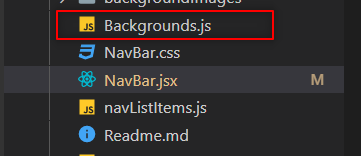
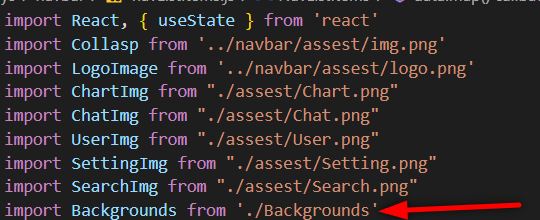
To create a card component, make a new file inside the components folder named Background.js. 👇
We will now use Backgrounds.js as an API. Define the info that'll be visible on the card within this file. Like this.👇
JS
//importing card image
import dash from "./backgroundImages/bg_dashboard.png";
import ideas from "./backgroundImages/bg_ideas.png";
import join from "./backgroundImages/bg_join.png";
import create from "./backgroundImages/bg_create.png";
import search from "./backgroundImages/bg_search.png";
const Backgrounds = [
{
id: 1, // this is the unique id
title: "Dashboard", //Title to show on card
type: "dashboard", //Type will help us to show different cards
description: "ReactPlay is an OpenSource to Learn, Create, and Share ReactJS Projects", //This is the description to show
statement: "Know More", //This is the content to show on the button
image: dash, // Image you want to show on the card
url: "https://reactplay.io/"
},
{
id: 2,
title: "Ideas",
type: "ideas",
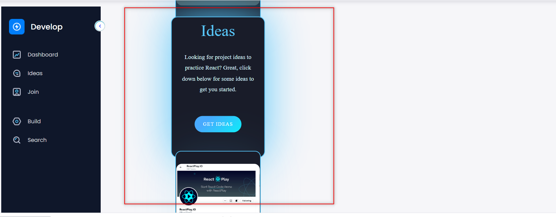
description: "Looking for project ideas to practice React? Great, click down below for some ideas to get you started.",
statement: "Get Ideas",
image: ideas,
url: "https://reactplay.io/ideas",
},
{
id: 3,
title: "Join",
type: "join",
description: "Join us on Twitter and be a part of ReactPlay Community",
statement: "Join Now",
image: join,
url: "https://twitter.com/reactplayio",
},
{
id: 4,
title: "Build",
type: "build",
description: "Ready to create a new play? It is super easy, click down below to get started.",
statement: "Create Now",
image: create,
url: "https://github.com/reactplay/react-play/blob/main/CREATE-PLAY.md"
},
{
id: 5,
title: "Search",
type: "search",
description: "Start browsing the plays built by our community developers.",
statement: "Browse Now",
image: search,
url: "https://reactplay.io/plays"
},
]
export default Backgrounds; //exporting backgrounds.js
- Now import Background.js into NavBar.jsx👇
Fetching Data
Now, we will fetch out Backgrounds.js file data. Create a useState for fetching.
JS

    const [data, setData] = useState(Backgrounds);
Now, create a div inside the navbar-play-contain div
<div>

</div>
Now, inside this div, we will use our "map function" to fetch the data from the "Background.js file.
JS

   {data.map((values) => {
                        const { id, image, title, discription, statement, url } = values
                        return (
                            <>
                                <div className={`card ${show} `} key={id}>
                                    <img src={image} alt={"card-images"} className={`images`} />  //card image

                                    // on hovering over the card 👇 this code will run
                                    <div className='hover'>
                                        <h2 className='heading'>{title}</h2> //title of the card
                                        <div className='text1'>{discription}</div>  //description
                                        <a href={url}> <button className='button'>{statement}</button></a> //button
                                    </div>
                                </div>
                            </>
                        )
                    })}
So, here I used the map function to fetch the data from the "background.js" file. Here,
- data is the useState that we created earlier.
- The parameter values is where we'll get our id, image, title, description, statement, and url. Then we have the div that shows the card and image that shows the image on the card.
Then there's the code, which is only visible when we hover over it.
After that, we'll add some CSS to make our card look nicer.
CSS for Card
- In CSS, we will use some common properties of CSS like transform, opacity, transition, display, etc.
CSS

.navbar-side-card {
  position: relative;
  top: -18rem;
  left: 8rem;
  display: flex;
  height: 330px;
  width: 220px;
  background-color: #191c29;
  border-radius: 15px;
  justify-content: center;
  align-items: center;
  flex-wrap: nowrap;
  flex-direction: column;
  text-align: center;
  border: 2px solid rgb(88 199 250);
  overflow: hidden;
  transition: .6s;
  box-shadow: 0px 0px 100px rgba(88, 199, 250, .15);
}

.nav-card-images {
  position: relative;
  font-size: 33px;
  font-family: roboto;
  color: rgb(88 199 250);
  font-weight: 100;
  letter-spacing: 1px;
  transition: .7s;
  transform: translateY(110px);
  top: -23px;
  border-radius: 15px;
}

.navbar-side-card:hover .nav-card-images {
  transform: translateY(-150px);
  opacity: 0
}

.nav-side-card-description {
  color: #dbf9ff;
  font-family: roboto;
  font-weight: 100;
  font-size: 14px;
  width: 170px;
  line-height: 25px;
  transform: translateY(200px);
  transition: .7s;
  opacity: 0
}

.nav-side-card-heading {
  font-size: 38px;
  font-family: roboto;
  color: rgb(88 199 250);
  font-weight: 400;
  margin: 0;
  padding: 0;
  transform: translateY(200px);
  opacity: 1;
  transition: .6s;
  opacity: 0
}

.nav-card-button {
  transform: translatey(200px);
  transition: .88s;
  opacity: 0;
  width: 110px;
  height: 38px;
  border-radius: 40px;
  font-size: 12px;
  font-family: roboto;
  text-transform: uppercase;
  font-weight: 300;
  letter-spacing: 1px;
  color: white;
  background-color: #0beef9;
  background-image: linear-gradient(315deg, #0beef9 0%, #48a9fe 74%);
  border: none;
  cursor: pointer
}

.navbar-side-card:hover .nav-side-card-hover {
  display: block
}

.navbar-side-card:hover .nav-side-card-heading {
  transform: translatey(-170px);
  opacity: 1
}

.navbar-side-card:hover .nav-side-card-description {
  transform: translatey(-150px);
  opacity: 1
}

.navbar-side-card:hover .nav-card-button {
  transform: translatey(-100px);
  opacity: 1
}

.navbar-side-card:hover {
  transform: scale(110%);
  box-shadow: 0px 0px 100px rgb(88 199 250);
}

.nav-card-button:active {
  color: #0beef9
}
As you can see, our cards are now displayed just to the side of the navbar.👇
We must now only show one card at a time. That is, when we click on a navbar item, only that card is displayed. So, to do this, we will employ the Filter Function.
FilterCards
To filter our cards' data, we'll need to use the "Filter Function." So, firstly we will make a new function named filterResult.
JS

//below of handleOnClick function

const filterResult = () => {
//filter function
}
- Now, we'll add a parameter to the "filterResult" function.👇
JS

const filterResult = (catItem) => {
   //filter function
 }
- Now, we'll create a constant variable that will only store the card on which we'll click.👇
JS

 const filterResult = (catItem) => {
        const result = Backgrounds.filter((currentData) => {
        });
  }
Here result is the constant variable that will store that type of card that will click on the navbar. If you hover your mouse over the currentData, you will see something like this.👇
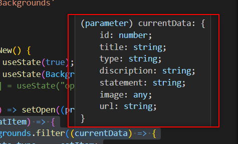
Here currentData will help us to know which item clicked on the NavBar.
- Now, we will going to return our card. 👇
JS

 const filterResult = (catItem) => {
        const result = Backgrounds.filter((currentData) => {
            return currentData.type === catItem; // Only return if the type of the current **Navbar** item is the same as the clicked **NavBar** item.
        });
    }
- Now, we will use our setData useState to show that particular card.
JS

const filterResult = (catItem) => {
      const result = Backgrounds.filter((currentData) => {
          return currentData.type === catItem;
     });
      setData(result)  // <-
  }
- Now, to make this function work, we will be going to add the onClick function in every list item of the Navbar.
JS

onClick={() => filterResult('dashboard')} // For the dashboard item, we will write dashboard, and for the **ideas item**, we will write **ideas** instead of dashboard.

// this **dashboard** is our **catItem** in the **filterResult**
- You have to do something like this.👇
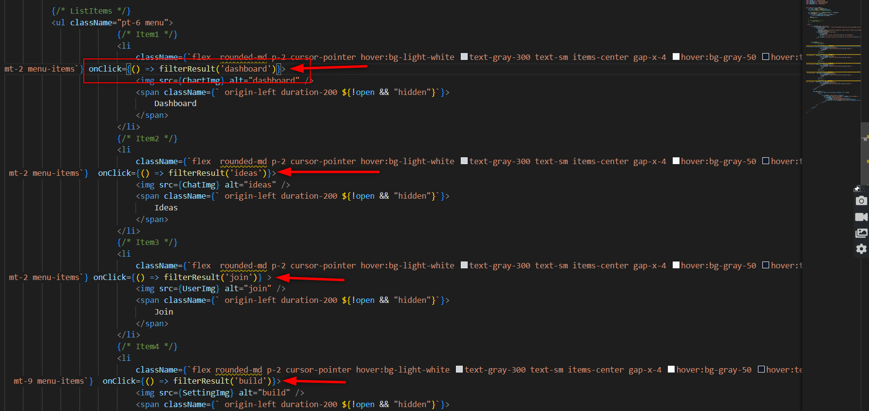
- Only the items linked with a particular item in the Navbar are visible when you click on it.
However, we must now hide all data and only show the card when we click on the NavBar.
Hide and Show Card
Create a useState and give it a string value.👇
JS

const [show, setShow] = useState("opacity-0");
//Here **"opacity-0"** is our Tailwind CSS property.
Create a method that will assist us in changing the opacity from 0 to 1.
JS

const handleOpacity = () => {
   setShow ("opacity-1")
 }
Now use show useState as a class inside the div that has the class name of navbar-side-card 👇
Now call the handleOpacity function inside the filterResult function.👇
JS

 const filterResult = (catItem) => {
      const result = Backgrounds.filter((currentData) => {
          handleOpacity();  // <- here we call handleOpacity function
          return currentData.type === catItem;
   });
      setData(result)
 }
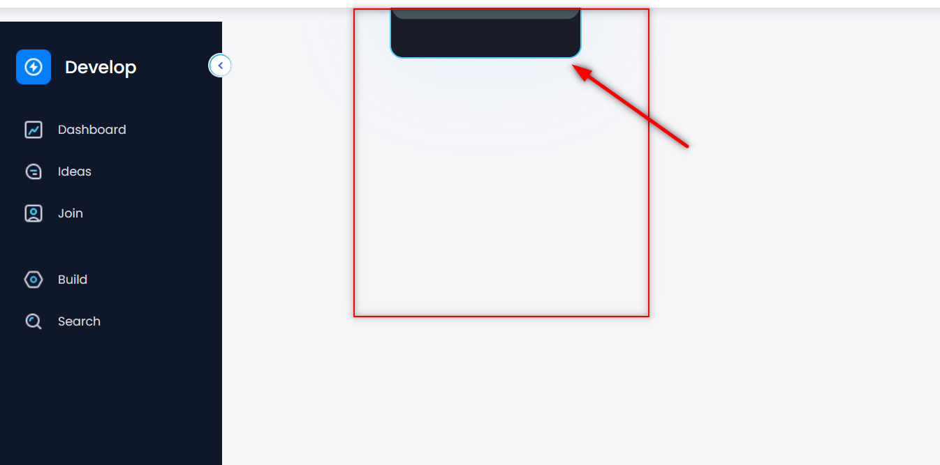
Now cards are hidden. It will only be visible if you click here on the Navbar item.
NOTE- If your card looks something like this👇
Then, modify the CSS of the card using the class name ".navbar-side-card."
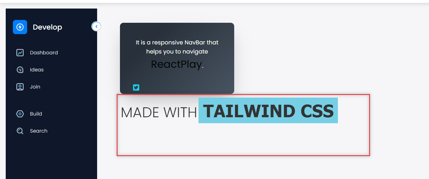
We built our Navbar and the Card. Now it's time to create this 👇 box component.
Build Box Component.
- To make this box, you must first build a new dive immediately above the map function.👇
JS

<div className={`card-content`}></div>
Here we have a div with the class name "card-content." Now create another div inside it with the class name side-box-contentiner.
JS

<div className={`card-content`}>
   <div class="side-box-contentiner"> //<- new div
   </div>
</div>
Now, inside this div, we'll insert the "para" tag.👇
JS

<div className={`card-content`}>
    <div class="side-box-contentiner">
        <p class="side-box-contentiner-sub">It is a responsive NavBar that helps you to navigate
        </p>
    </div>
</div>
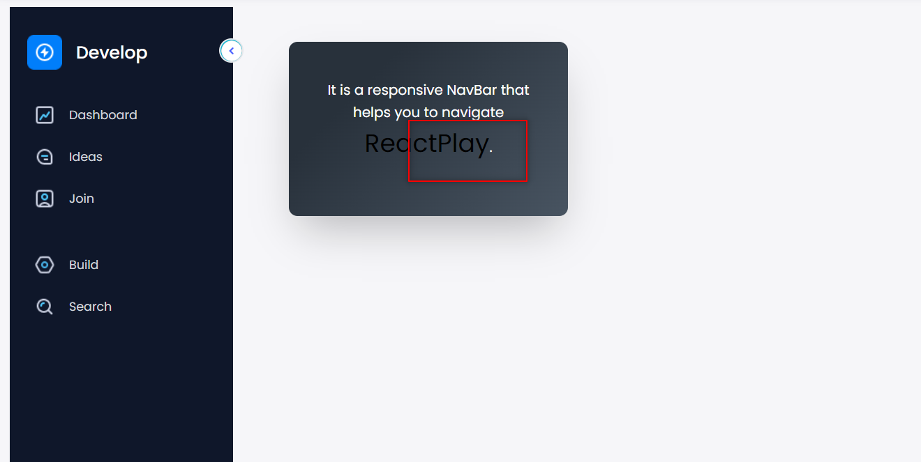
Now inside this para tag, we will add our animated title. So, here I am using ReactPlay. You can write anything in it.
So, firstly we will HTML for it.
JS

<div className={`card-content`}>
    <div class="side-box-contentiner">
        <p class="side-box-contentiner-sub">It is a responsive NavBar that helps you to navigate

            // here is our animated title 👇
            <button id='side-box-neon'>
                <span id="re">Re</span>
                <span id="a">a</span>
                <span id="c">c</span>
                <span id="t">t</span>
                <span id="pl">Pl</span>
                <span id="a2">a</span>
                <span id="y">y</span>
            </button>
        </p>
    </div>
</div>
So, in this case, I'm using a button tag with the id side box-neon, followed by some span tags with different ids based on the length of the text. Now we will add some of the CSS to make it work.
So, the first thing that we have done here 👇 is:
CSS

button#side-box-neon {
  font-size: 29px;   //giving the font-size to the button
}

#side-box-neon:hover span {    //add animation on hover
  animation: flicker 1s linear forwards;    // The animation is called **flicker**, and it has a 0.1s delay and travels ahead linearly.
}

#side-box-neon:hover #a {
  animation-delay: .2s;  //here it lighup the letter **"a"** after **0.2seconds**
}

#side-box-neon:hover #c {
  animation-delay: .5s; // Same here. Here it lighup the letter **"c"** after **0.5seconds**
}

#side-box-neon:hover #t {
  animation-delay: .6s;   //same as above
}

#side-box-neon:hover #pl {
  animation-delay: .8s;
}

#side-box-neon:hover #a2 {
  animation-delay: .9s;
}

#side-box-neon:hover #y {
  animation-delay: .9s;
}

//**Note-** You can modify these delays to suit your needs.
- Now, we'll add Keyframes to make this fully functional.
CSS

@keyframes flicker {
  0% {
    color: #333;   //without hovering the color will be "#333"
  }

  5%,  //after 5%
  15%, //after 15%
  25%, //after 25%
  30%,  //after 30%
  100% {  //and at 100%
    color: #fff;  //the light will belew up.
    text-shadow: 0px 0px 25px cyan;
  }

  10%,
  20% {
    color: #333;
    text-shadow: none;
  }
}
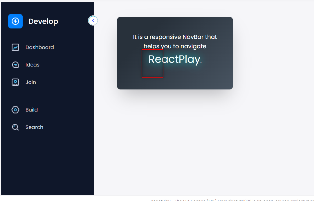
Now our project will look something like this👇
However, It won't work because there's a card on top of this, which is hidden. Now, if you click on any item of the Navbar, you can see that card too.👇
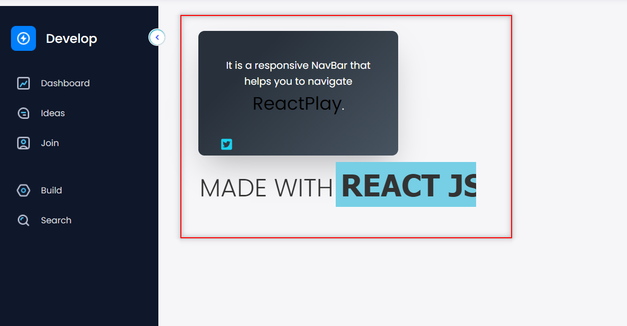
Only when you click on this will the text blow up. 👇
Now we will make a logic where we will increment the z-index of the card and click on the items on the NavBar will show the card and hide the box.
Show Hide Box
So, firstly create a new state.👇
JS
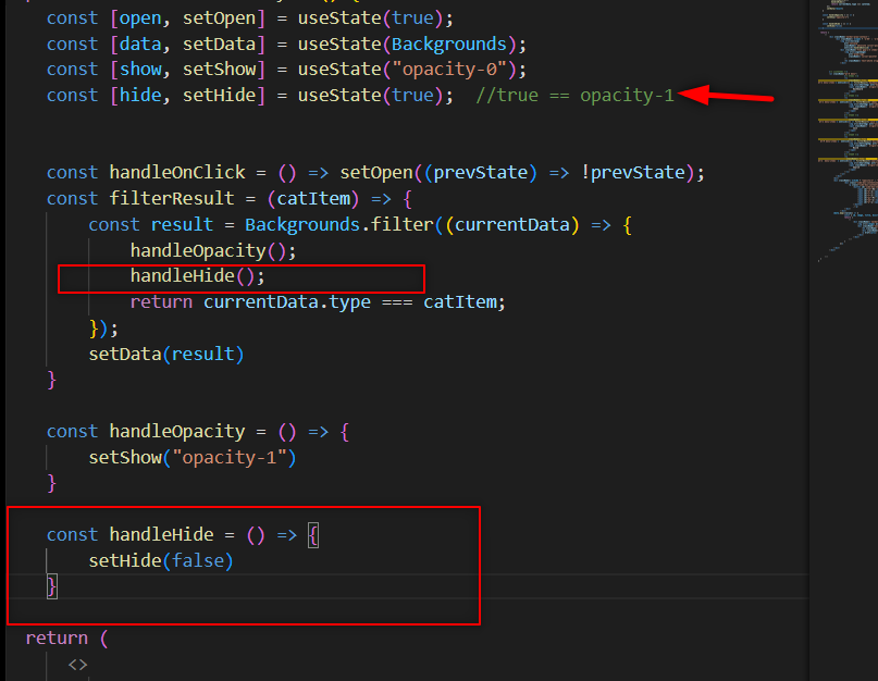
const [hide, setHide] = useState(true); //true == opacity-1
This state will help us to hide and show the box component.
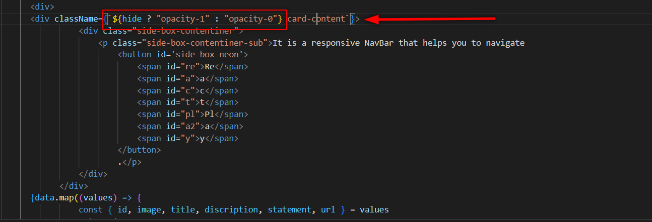
Now, inside the div that has the class name of card-content, add this👇
JS

<div className={`${hide ? "opacity-1" : "opacity-0"} card-content`}>
</div>
Your code should look something like this👇
Now create a new function that will handle this hide state.
JS

 const handleHide = () => {
      setHide(false)
  }
And now call this function inside the filterResult function. 👇
If you click on any item in the NavBar, the card will appear, and the box will be hidden.
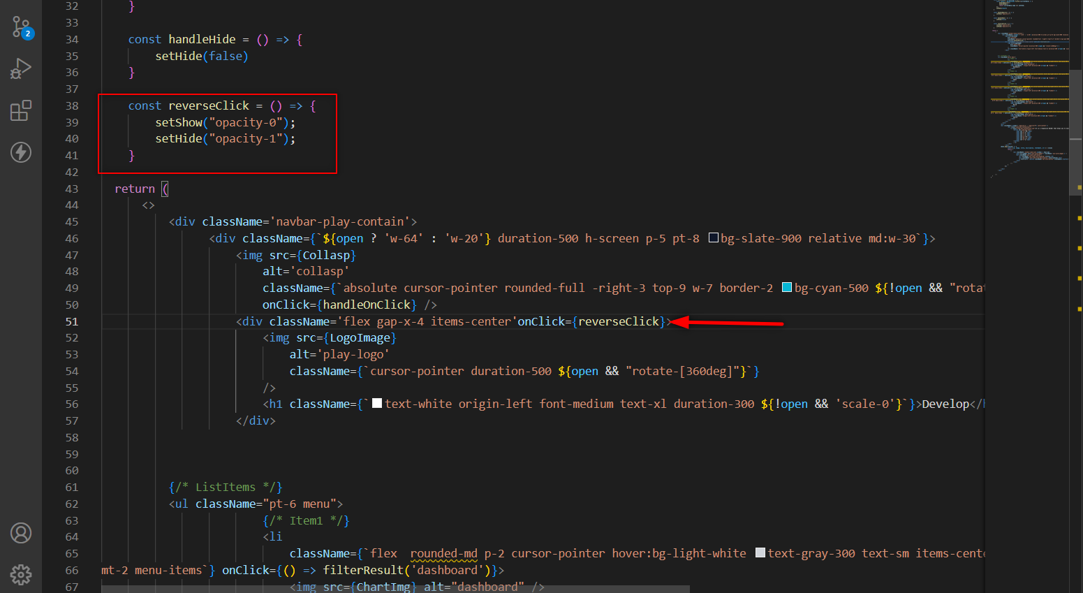
- We'll need to reverse the opacity of the card and box to make it visible. Create a new function to accomplish this.👇
JS

const reverseClick = () => {
    // This will reverse the opacity
  }
And now set the state of the Hide and the Show👇
JS

 const reverseClick = () => {
      setShow("opacity-0");
      setHide("opacity-1");
  }
Now call this function inside our logo div.
JS

<div className='flex gap-x-4 items-center' onClick={reverseClick}>
    <img src={LogoImage}
        alt='play-logo'
        className={`cursor-pointer duration-500 ${open && "rotate-[360deg]"}`}
    />
Your code will look something like this👇.
Now, clicking on the NavBar items will hide the box, while clicking on the Navbar logo will show the box.
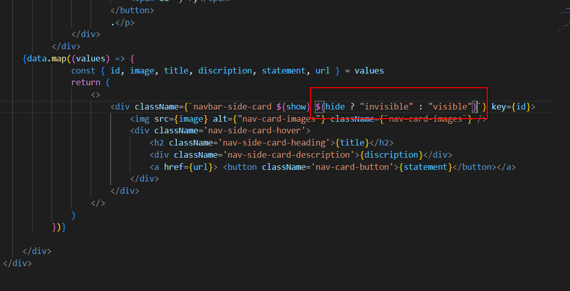
And the last is to make the card invisible whenever the box shows up. Use the Ternary operator to accomplish this.👇
Now, your card will work fine. Now, let's build this part👇.
Text Animation
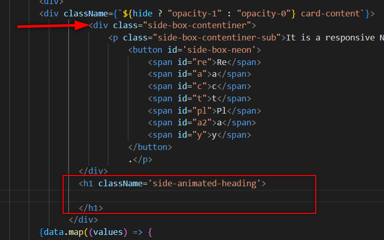
This part is going to be the easiest part of this blog. First things first, create a new h1 with the class name side-animated-heading just after the div that has the side-box-contentiner class name.Like this👇
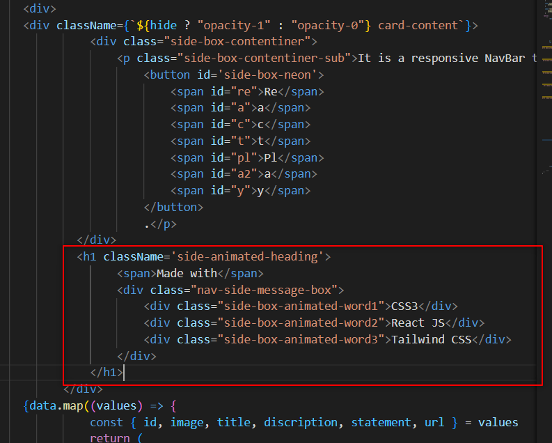
- Now, make a span and a div, and then inside this div, make more than three divs that contain our text animation. Like this👇
JS

<h1 className='side-animated-heading'>
    <span>Made with</span>
    <div class="nav-side-message-box">
        <div class="side-box-animated-word1">CSS3</div>
        <div class="side-box-animated-word2">React JS</div>
        <div class="side-box-animated-word3">Tailwind CSS</div>
    </div>
</h1>
And, your code will look something like this. 👇
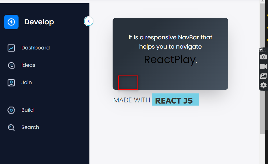
Now, you will see that your text will be visible to you. Now we will add animations using CSS.
Adding Animation To The Text
- First, apply some basic CSS to the heading.👇
CSS

h1.side-animated-heading {
  color: #333;
  font-family: tahoma;
  font-size: 3rem;
  font-weight: 100;
  line-height: 1.5;
  text-transform: uppercase;
  white-space: nowrap;
  overflow: hidden;
  position: relative;
  width: 610px;
}

h1.side-animated-heading span {
  font-size: 40px;
  margin-left: 2px;
}
- And for the text, we will give some padding, position, font style, and background.👇
CSS

.nav-side-message-box {
  background-color: #76cfe5;
  color: #333;
  display: block;
  font-weight: 900;
  overflow: hidden;
  position: absolute;
  padding-left: 0.5rem;
  top: 0.2rem;
  left: 220px;
  animation: openclose 5s ease-in-out infinite;  //here openclose is the animation name[you can give any name to this.]
}
At last, add the keyframe to the openclose animation.👇
CSS

@keyframes openclose {
  0% {
    top: 0.2rem;
    width: 0;
  }

  5% {
    width: 0;
  }

  15% {
    width: 150px;
  }

  30% {
    top: 0.2rem;
    width: 152px;
  }

  33% {
    top: 0.2rem;
    width: 0;
  }

  35% {
    top: 0.2rem;
    width: 0;
  }

  38% {
    top: -4.5rem;

  }

  48% {
    top: -4.5rem;
    width: 250px;
  }

  62% {
    top: -4.5rem;
    width: 250px;
  }

  66% {
    top: -4.5rem;
    width: 0;
    text-indent: 0;
  }

  71% {
    top: -9rem;
    width: 0;
    text-indent: 5px;
  }

  86% {
    top: -9rem;
    width: 450px;
  }

  95% {
    top: -9rem;
    width: 450px;
  }

  98% {
    top: -9rem;
    width: 0;
    text-indent: 5px;
  }

  100% {
    top: 0;
    width: 0;
    text-indent: 0;
  }
}
Note here👆 0% to 30% is for first word(CSS), 33% to 62% is for second word, and from 66% to 100% is for the third word.
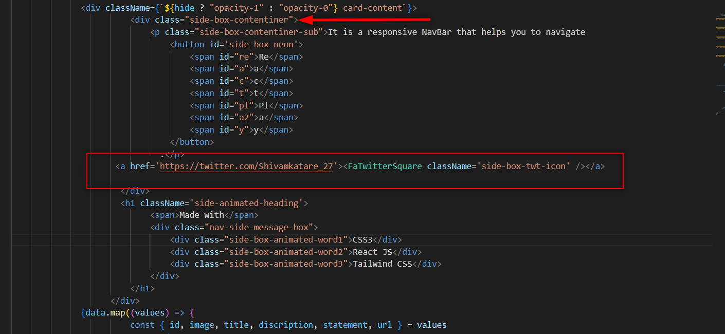
Now, as you can see, our code works perfectly, and all you need to do is put the Twitter Button here.👇
Adding Logo
To add the logo, import the Twitter Logo from React icons.
JS

import { FaTwitterSquare } from 'react-icons/fa';
And, then use this icon inside the anchor tag.👇
JS

<a href='https://twitter.com/Shivamkatare_27'>
  <FaTwitterSquare className='side-box-twt-icon' />
</a>
Here.👇
Coclusion
As you can see, we finished our project. I hope this blog has taught you something. If you learn something from this site, please share it with your friends and publicize it.
- Note- For the CSS Styling, you can check out this GitHub Link